Brand Strategy Brand Identity Responsive Website
Harmony interior design
About Harmony interior design
Harmony is an interior design company in Hong Kong. Along with the growth of its business and transformation of its customer base, we helped Harmony to reshape its brand image. Specifically, it was necessary to show "harmony" in the relationship between interior design and daily living, so as to integrate the designers' concept with their company.
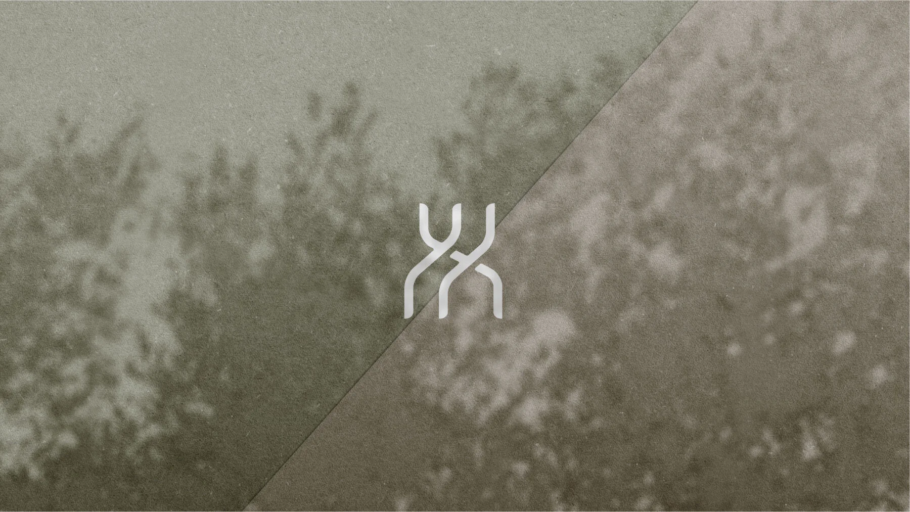
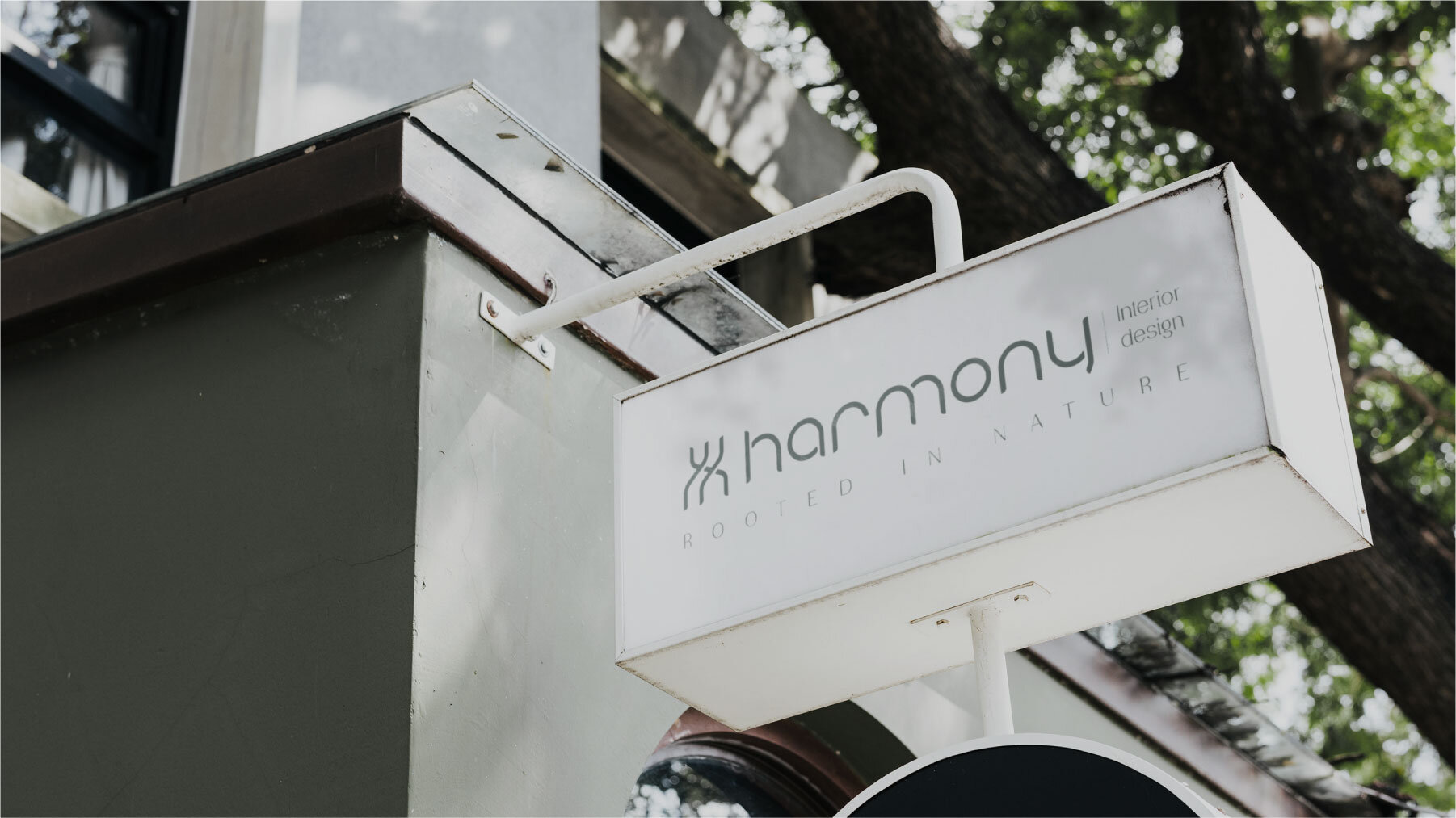
After analyzing the philosophy of the target consumers and company, we established the concept of being "rooted in nature." We believe that the source of human life comes from nature. Aside from the development of civilization, human beings began to develop the concept of "residence." "Harmony" in interior design should be a pure combination between human and nature, and a kind of concept born out of nature. The design of one's residence should be an integration of the universal connections between human and nature.
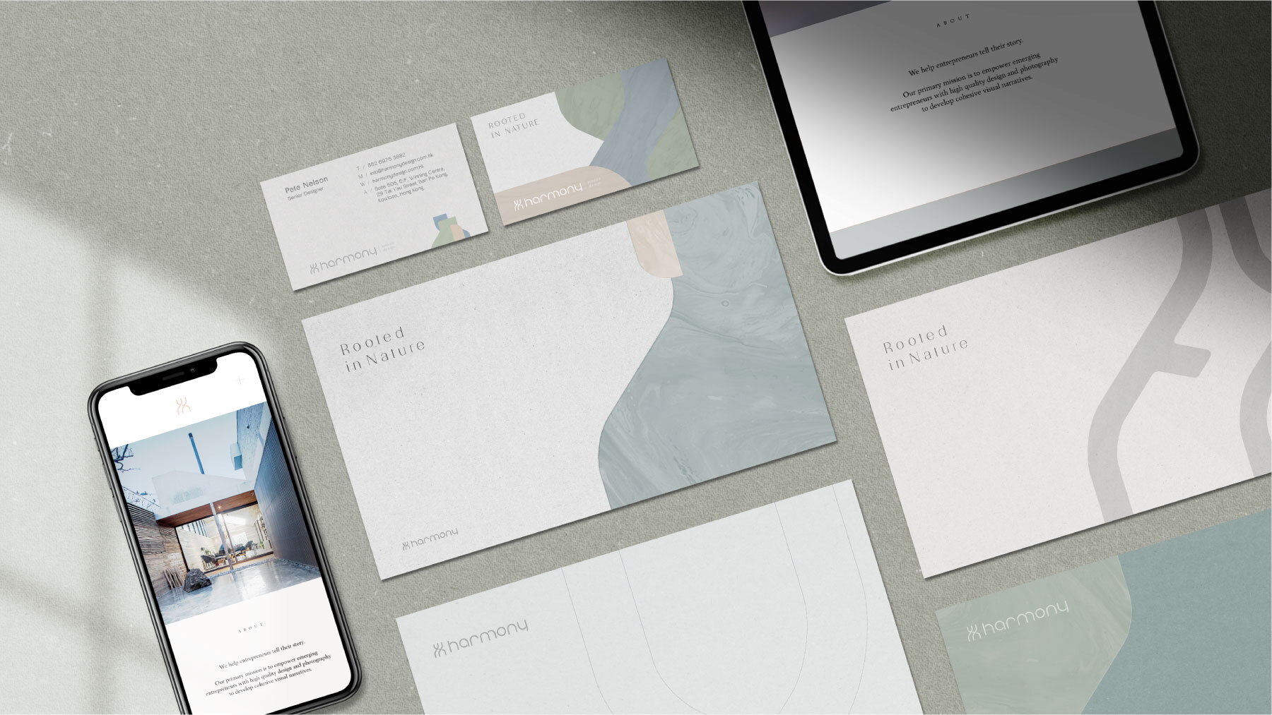
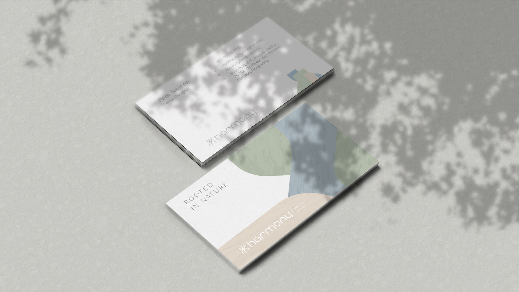
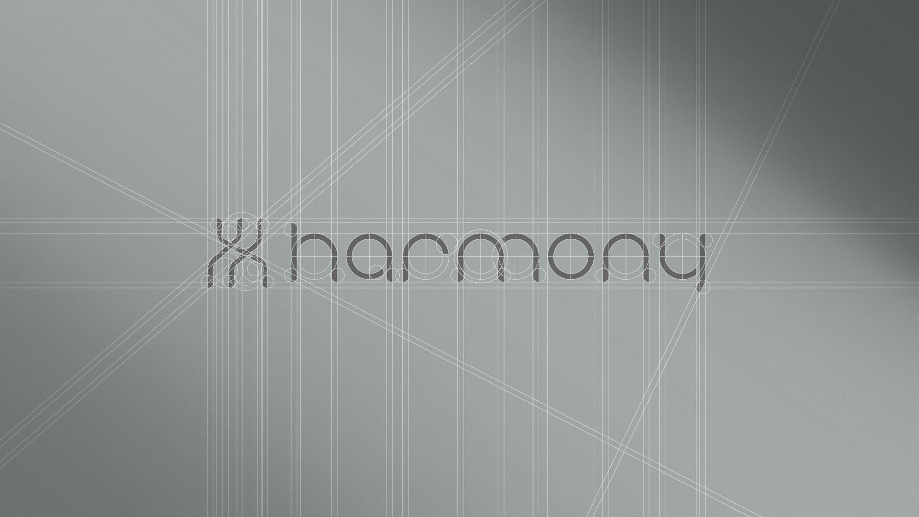
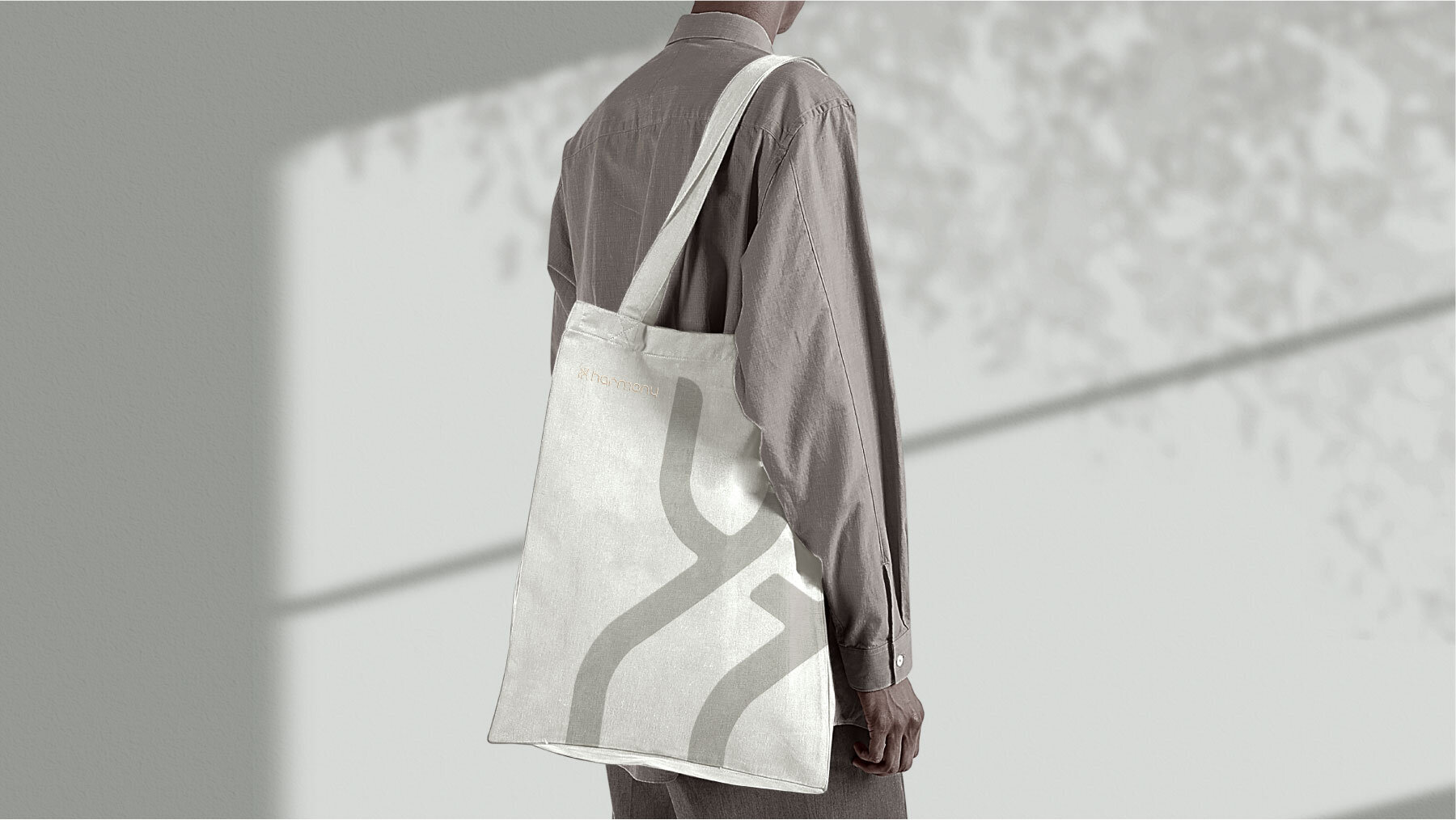
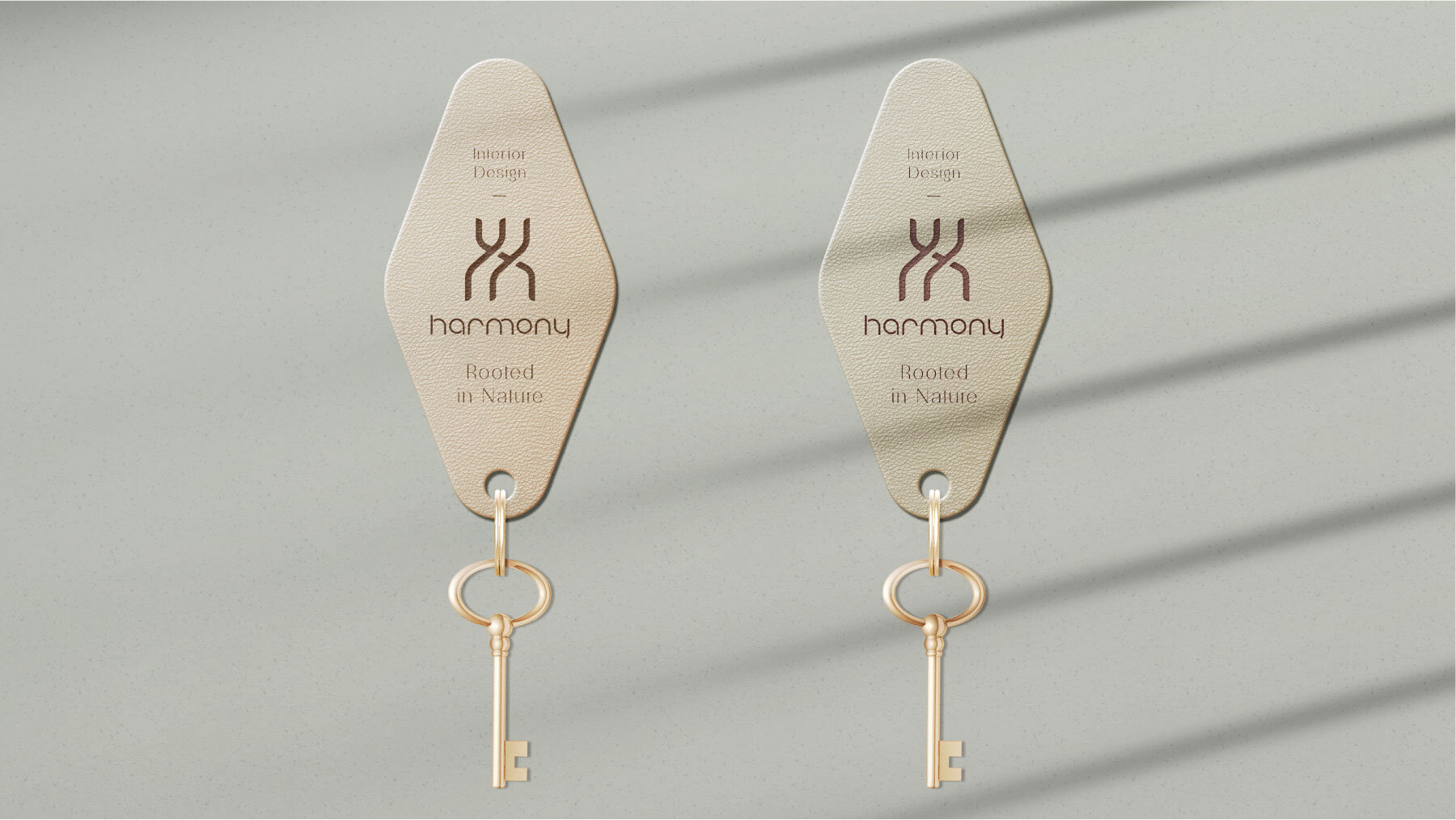
Following the concept of being "rooted in nature," we showed it through graphics and visuals related to nature. The logo design was based on the initials of the word "harmony," in which the shape of a house is formed by expanding linear symbols in the way of the flow of nature. In terms of the visuals, we constructed a series of graphic combinations, to represent creations as a result of natural combinations, much like the recombination between creativity and space in interior design. In terms of the staff badges, we extended this concept such that every staff badge contains a symbol on it derived from the brand visual.